Sidebar panels (navigation, applications, etc)

Jira for this discussion: Loading...

Hi everyone, just like in XWiki, Cristal will have its panels in sidebars for a number of different scenarios and layouts. Initially the most common one will be the navigation between pages, but the same concept can be used for applications, help tips, general info, etc.

Frame 1

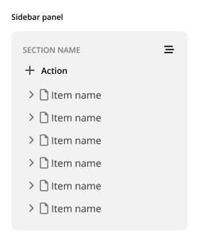
The basic panel consists of the following elements:

  • Panel header, with sub elements like:
    • Name
    • Main Action (where applicable)
    • Dropdown menu (where applicable)
  • Panel content
    • Contextual dropdown menu

Frame 6

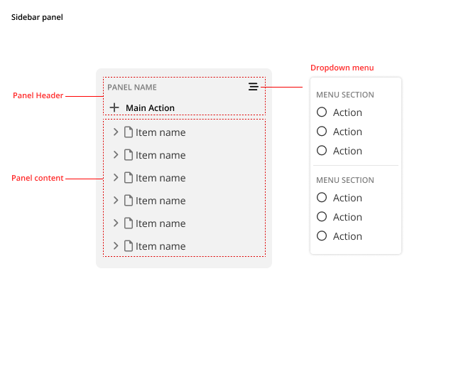
These elements ensure that, initially, we have a basic framework for different uses. Below are a set of images of different states and configurations.

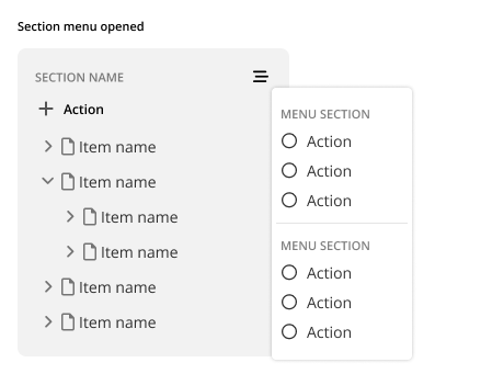
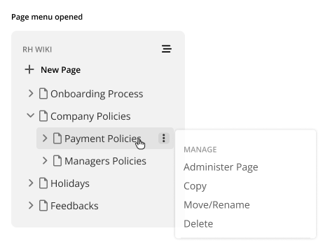
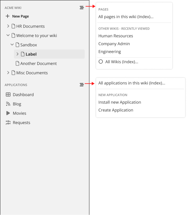
Each panel can have a contextual menu for itself, important for giving the user features that are not primary actions but are related to the panel. For example, in the navigation panel it can provide a link to the index of pages, sub-wikis, recently visited pages or wikis, etc.

Frame 4

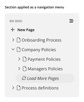
Example with a button “load more pages”:
Frame 3

In the navigation panel we also have basic control over the page via a specific menu. This menu is a trimmed down version from the one that opens in the page itself.

Frame 1-1

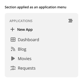
Example of the panel for an Application list. The application feature it’s not in MVP so it may be a while for us to see it in action.
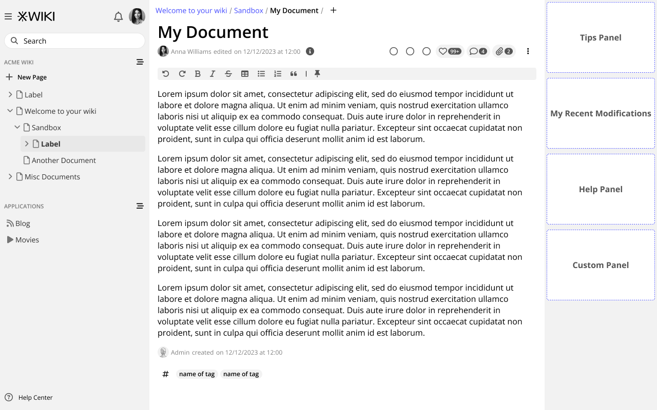
Frame 5

Panel in Sidebar:

sidebar menus

Context in the whole interface:

single sidebar

This is it for now

Thank you all for reading.
I would very much like to know your thoughts on this!

1 Like

Looks very good to me.
As the one yet in XWiki, but enhanced, more clear, more compact.
Clear presentation with these drawings.
Thank you.

1 Like

I like this UI very much and would love to see this in XWiki.

It looks way more clean and modern than the regular XWiki UI and would definitely enhance the User Experience.

2 Likes

Hellooo! Thanks for the work on this proposal, Thiago! Looks really good!

I have 2 very little comments:

Is it possible to have slightly more space between the icons and application names? They feel a bit too close together.

Here, the applications have the page icon and the application icon. Was that intentional? It looks a bit strange to me, but It’s possible that I’m missing the idea.

Apart from these, everything is very very nice! :partying_face:

2 Likes

Sure, no problem. But I need to emphasize that these are mostly wireframes, so details in fonts, spacing and color are likely to change later.

Whoops, my bad! It was indeed a mistake and I edited the original post. Thank you for noticing =)

Ah yes, you right, sorry about that. I sometimes forget they are wireframes as they are very hifi

Thanks Thiago. Looks good.

Some minor comments:

  • I guess the need for the main action concept in the panel header is to standardize it in the case a panel needs a main action.
  • For the App Panel, I’m not sure I’d put a “New App” entry (even though it would be only displayed for admins), since it’s not something you may want to do often, I feel it would provide less clutter to have it only in the dropdown menu
  • Similarly I’m not sure about the “New Page” main action for the navigation panel as it would push users to create pages at the root of the wiki which is not recommended. I feel it’s better if they used the “New Page” button that would appear when you highlight a tree node and which is not in your screenshot but that we discussed in the proposal about the navigation panel. I’d put the “New Page” action only in the dropdown as a secondary option (or remove it altogether, to be decided). I understand it’s a visible call to action for users but I’m not sure it’s the right thing to do. To be discussed in the other thread though. Just mentioned it here since you put the nav panel as an example. We’ll also need to handle the manual ordering concept that @mflorea will add in XWiki 16.3.0.
  • What’s missing IMO is the ability to fold/unfold the sidebars but that could well be in some other proposal. I just don’t see how to do that in your screenshots.
  • Should users be able to fold/unfold panels? I don’t know if it’s needed but maybe it should be discussed.
  • The navigation panel is also missing an input field to filter entries IMO. See the other thread about the nav panel.

Thanks

1 Like

It is, yes. I don’t know yet if we will need more, but we can discuss it if the need arises.

Not disagreeing, but I’m curious to know why it is not recommended.

Got it, I’ll make a mockup this way so we can discuss it better. Also with the manual ordering options.

Indeed, this feature is missing, I think it could be an option for panels but not mandatory, meaning not every panel would have it. I’ll work on it.

Could this be handled by the main search, perhaps? This way we could provide a single point for searches instead of dividing it in two sections, like in XS. I understand that quicksearch is not in MVP, but it is a feature that would absorb well the job of the pages filter, in the future.

Because one core principle of a wiki is to create a hierarchy of linked pages. That’s what differs it from, say, Google docs/sites, where all docs are created at the root and don’t have links between them. We want to push users to create hierarchies to organize their content, as much as possible.This is why, btw, that the current Create button in XS opens a dialog to create a new page under the current page and not at the root.

We could imagine the same though, ie that the “Create +” button at the root of the Navigation Panel would not create a page at the root by default but under the current open page, but allowing the user to change the location in the create UI. What I think we should avoid is, to direct users to create pages at the root by default.

The main search is serving a different purpose IMO: it’s meant to search inside the whole wiki, with advanced features. The input field of the navigation panel is the one from the tree widget. You can see an example in action at Pages on this Wiki - XWiki for example. It serves to filter the tree to find the page you’re looking for.

The quick search would be closer to the panel nav input but not quite since the quick search searches in various categories (not just pages, e.g. users, attachments, blog posts, etc). For me the closest in XS is when you hit Ctrl+G to navigate to a page.

To be discussed.I agree that we need to be careful that it’s clear for the users what to use when and to reduce the screen clutter.

thx

1 Like

Thank you for the explanation, I wasn’t aware of it.

Thanks, makes sense. I will think more on this, maybe present the filter as icon only, accessible also by a keybinding, maybe.