Improvements on the Search page

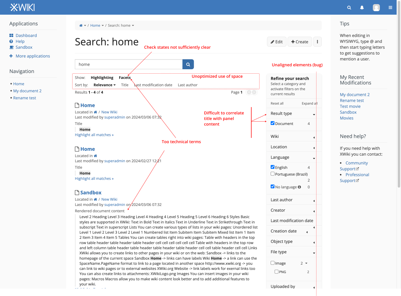
Hey everyone, while researching XWiki I found some minor problems in the main Search page. Stuff like many technical terms being used, content misalignment on the filters, lack of default components where one would be a better fit and other minor ones.
So I would like to make a proposal with some minor improvements. These are filled under the issue Loading...
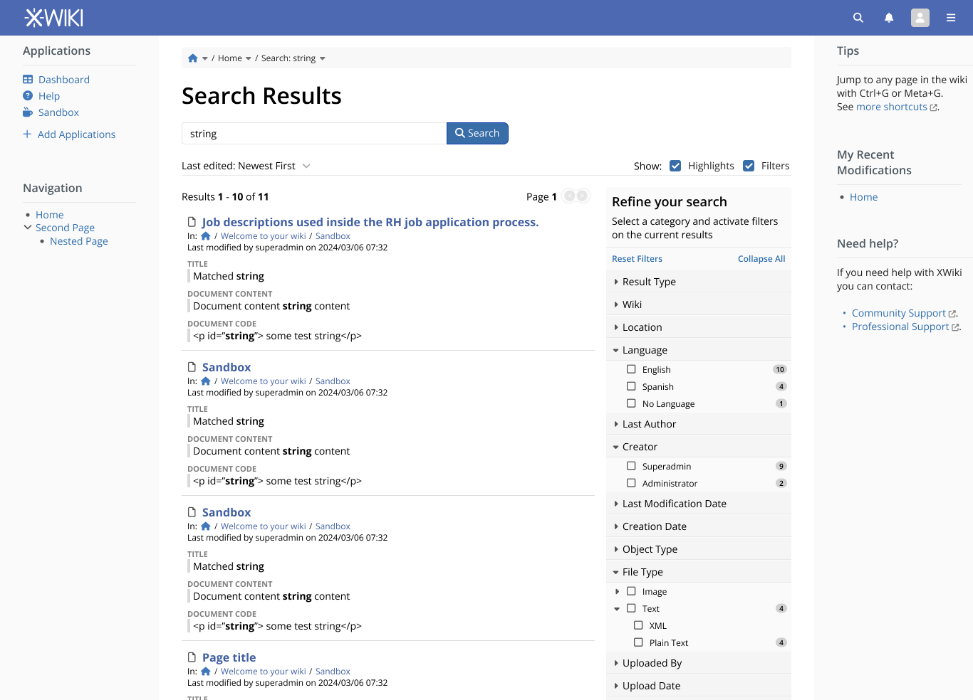
Context:
context

The improvements I would like to propose are listed in the image below. Explanations follows after that.
changes without annotation

Annotated changes:
changes annotated

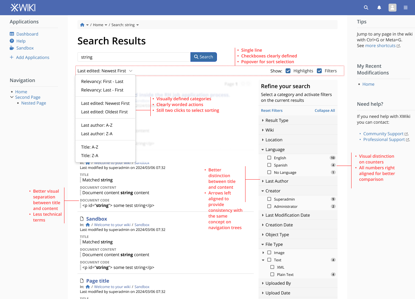
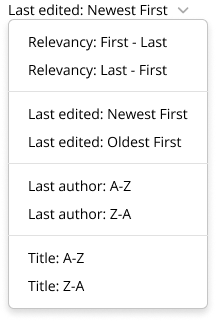
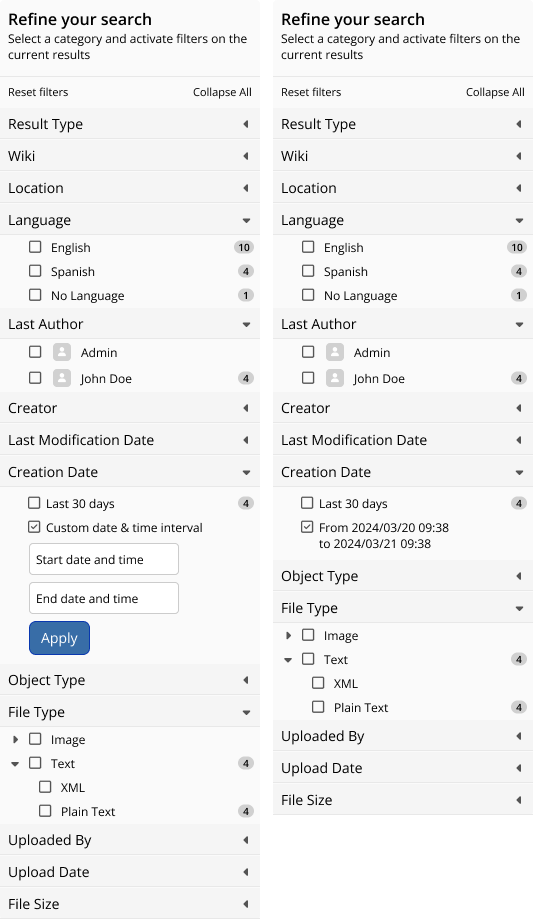
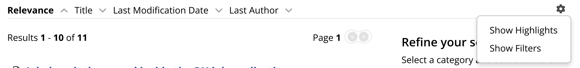
Sorting selection via pop over

The current way of sorting is efficient, but waste space. We could improve it by showing it under a pop over, with the categories of sorting separated by a line and each option clearly stating its use.
To make a selection we would have two clicks of interaction (one to open, another to select) but it would be consistent and a lot of space would be saved. This version also scales better in case we have more sorting options in the future.

sorting menu isolated

With the horizontal space saved we can improve the vertical space occupation by placing the visibility control of elements on the same line.
Note that I changed the elements to have the proper checkbox looks, for better understanding of its use.
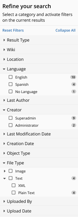
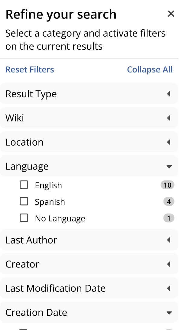
Screenshot 2024-03-12 at 12.58.06

Technical terms

Words like, “facets”, “Rendered Document Content” and “Raw Document Content” are very developer oriented so I am suggesting to change them to “Filters” “Document Content” and “Document Code”
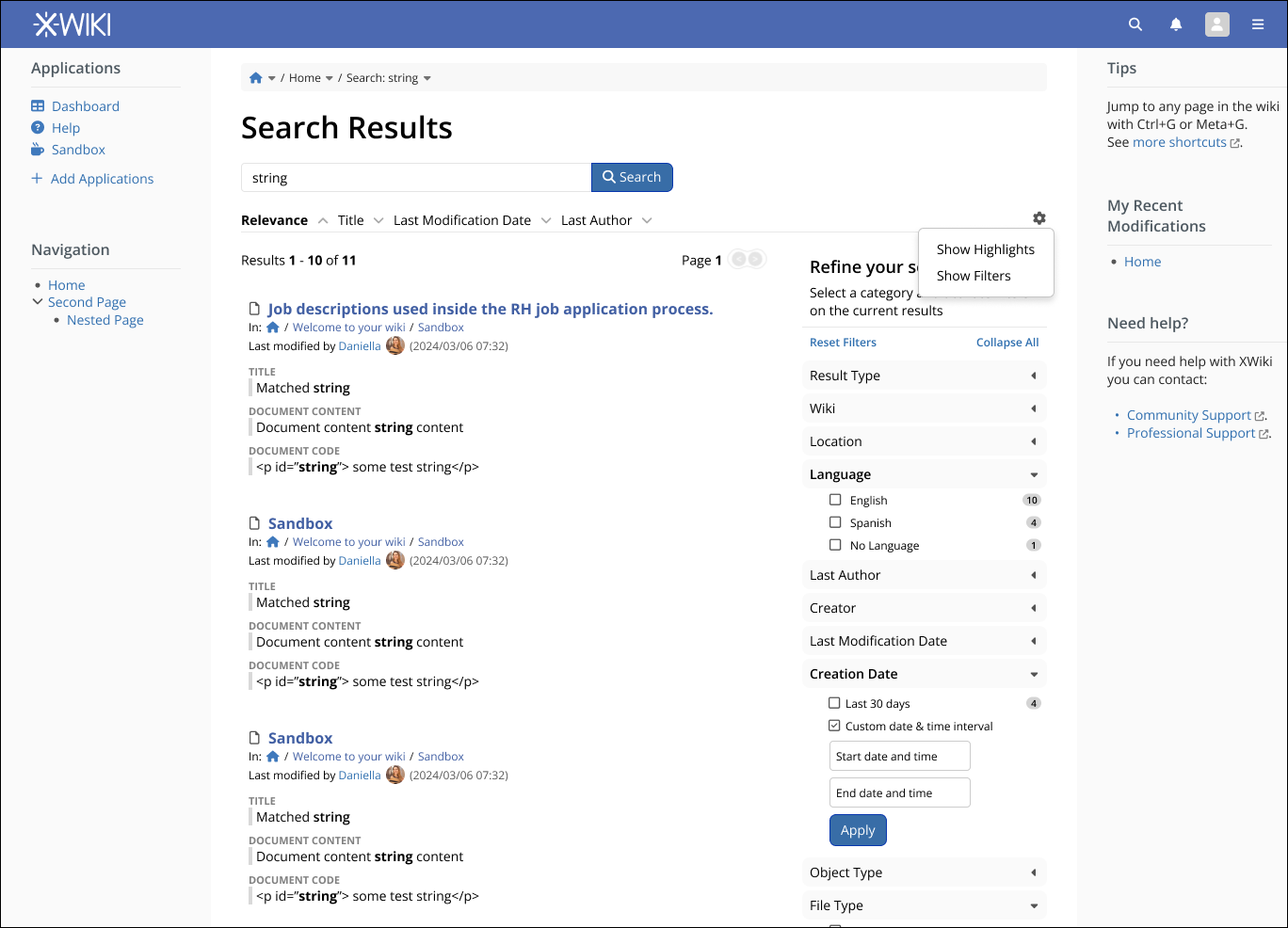
Filter box

Here the changes are mostly for better visual communication and standardization. Titles and content were differentiated a little bit.
The open/close arrow was moved to the beginning of the line, so the user can see better that it can be opened.
Numbers were right aligned and visually highlighted. The alignment issues I believe is a bug in the current version.
Also, the Reset and Collapse options at the top were given the standard “link” color to better communicate the action.

search filters

WDYT?

3 Likes

+1 this looks great!

  • Arrows left aligned : -0, see XWIKI-14873: Accordeon in the Administration misses an indicator to show they are expandable by Sereza7 · Pull Request #2774 · xwiki/xwiki-platform · GitHub, I conducted a quick review of how we use carets on the left in XWiki platform. On your example we can see that the breadcrumb have the carets on the right of the items, which makes it less consistent. In my opinion it’s not really worth it to update it. There’s always the cost of changing user habits and I don’t think the advantage described here is enough to balance out this cost. (implementation tip: we don’t have a caret-right icon so I recommend to rotate the caret down :slight_smile: 
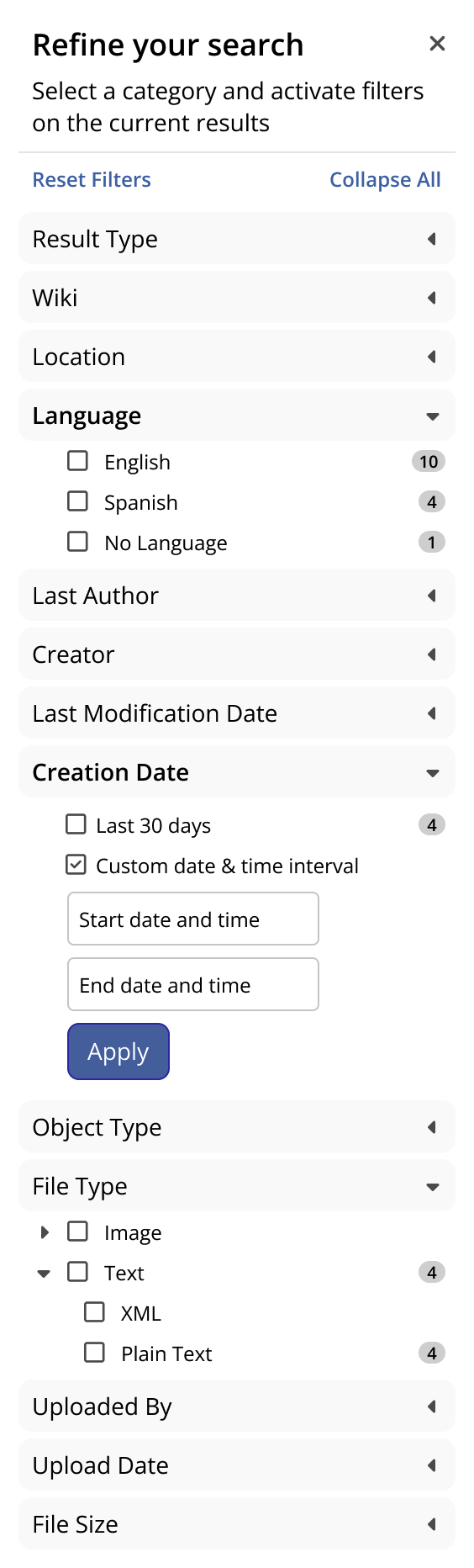
) This would make things easier for the sub category carets (e.g. those in file-type) where we also want to display the amount of items on the right…
  • +1 for others changes overall

Is the pop over wording important? Usually when I describe these elements I use dropdown. I think this element should align in terms of functionality and style with other dropdowns. Do you have a reason why this shouldn’t react and/or look like the moreAction dropdown (see picture below) for example? It might be a bit of a nitpick, but I think it’s important to know if we’re talking about the same thing and make it clear in our documentation and code down the line :slight_smile:
popoverdropdown

We have multiple kinds of filters in XWiki. In my opinion, we should add precision to Filter at least in some places so that they are not mistaken with Notification filters :slight_smile:

Looking good :+1:
Note that there’s a couple places where things get a bit complicated in this search filter selector. From what I could remember, the date filters have a custom date option with a date picker. For implementation we need to make sure those date pickers are still somewhat in line with the new visuals.


Thank you for this proposal @tkrieck ! :slight_smile:

Not a problem, I adjusted it in my mockups

Not really, is a habit I have from working on other projects. We can standardize on dropdown without a problem.

Even with the same wording, the context is different. Is there a scenario in which notification filters and search filters would be used interchangeably?

Noted :+1:, I will do a mockup with different filters to test them visually.

1 Like

Here’s a version with more filter types mocked up and the accordion arrows adjusted.

filter types

2 Likes

Hellooo everyone! Just read the proposal and it’s really, really good, thank you for working on this, Thiago! :star_struck:

Some ideas

I tried to use what you’ve done to include my ideas and suggestions explained below in this mock-up:

search

Explanations

Sooo, the ideas… they may or may not clash a bit with your redesign. :sweat_smile: They are more like suggestions:

Facets

The Facets button just collapses or extends the Filters Panel, right? Why not have directly on the Filters Panel? If it does anything else, let me know, it’s possible that I miss something.

Sorting

I actually liked the way I switched between sorting types, it made the search just a tiny bit quicker; I could check what kind of results each type of sorting would give me and then commit to the most relevant one.

I understand that the dropdown would be much more scalable and, UI wise, it’s just much better. UX wise, I’m not completely sure.

I think there is a way of saving space AND not choosing a dropdown.

Results spacing

I feel results are pretty close to each other and the info doesn’t breathe in the page (if that makes sense), both in the initial version and in your redesign.

I propose:

  • having a bit more space between each result
  • having a bit more spave between the main info of the page and the highlights

This space would extend the page downwards, but users don’t mind scrolling a bit more if the page feels lighter.

Filter panel coloring

I feel like this panel has too many shades of gray and it makes it feel old-ish, too detailed, making the page feel a bit overwhelming.

We can have a white background and make use of bold to highlight the collapsed filters’ headers.

It would all look cleaner this way.

Pagination

The current pagination looks like it could use a revamp. Maybe place the current page in the middle of the two arrows.

Last editor picture

It’d be a nice detail to have the picture of the last editor/modifier in the result. Makes the knowledge feel more human and, also, makes it easier for people in big companies/organizations to identify knowledge by faces they know.

Let me know what you think about all of this whenever you get the time :blush:

2 Likes

+1 for these cool ideas!

I’d like to add that when the search page is added to say a home page using
{{include reference=“Main.Search” /}} that filtering causes duplicates of the rest of the page to load.

I’m not sure where this comes from (or of it’s intentional behavior when using the include macro) but potentially warrants a fix!

Hi @amilica thank you very much for your considerations!

It hides and show it entirely. In this case I think it’s better to keep it hiding because when collapsing a significant interface element still is visible and takes a lot of horizontal space. This can lead to line breaking in small screens. But I agree that we could have the control directly on the panel, I would just use an X to close the panel, to get the panel back there would be a new control described below. What do you think?

Screenshot 2024-03-19 at 08.09.49

We could invert the logic and use the dropdown on secondary controls, like the visualization options (show filters and highlights). That way, we could have almost the entire line for sorting and a new “config” icon to choose what is available in the interface.

Screenshot 2024-03-19 at 08.12.24

This is to keep up with XWiki philosophy of giving user content priority in space. That’s why I inserted a divider line between results, it keeps search results separated but still condensed. We can tweak it, but it will be a balancing act between screen space and content separation.

We could go all in and remove all borders altogether, use bold text like you said and keep just one shade of gray on panel titles. It would make the panel feels lighters and I think it still keeps content separation nicely.

Screenshot 2024-03-19 at 08.24.17

Agreed, but IMO it requires a proposal on itself because it would change the pagination layout on the whole system. I will keep this in mind for a roadmap item.

That’s a very good idea, and we already have a precedent on this on the notifications. However, placing the avatar in the middle of the sentence fells weird to me because it is breaking my reading flow. This can be completely personal but how about we place it at the end, so the user can read the line “last modified by User Name” in its entirety, then comes the avatar and then at the end comes the supplementary info of date and time.

Screenshot 2024-03-19 at 08.38.00

Here is an updated mockup with everything discussed in context:

context

1 Like

This looks really good! :partying_face: I agree with all of your points. The filter panel looks even better like this and the configuration icon for highlights and filters feels like a good idea.

I was debating in my mind if maybe it would be good for the dropdown to open on hover on the config icon instead of clicking on the icon. WDYT?

1 Like

While it would be quicker to open, it would also require the user to have good motor control on the mouse, so it can impact accessibility. Also, other elements on XWiki UI, that shares similar functionality, use the click as a standard, like the “more” button on each page.

Ah, good thinking, you’re right! Thanks!

1 Like

Global comment: LGTM! Thanks :slight_smile:

I’m not sure for Facets. We use this terminology in the code and on xwiki.org. Users can customize them and add new facets. I think it could cause confusion if we were to use different terminology for the same concept in the XWiki UI and on xwiki.org.

I’m not a big fan of this (very close to -1) as I don’t see what it brings but the downside is quite obvious to me: it attracts the eye on something that is not relevant to the task at hand. We need the user to focus on the matched text instead.

Why would users want to see the last authors of documents when they search for something? What would make sense would be for them to see the author of the matched words, but that’s hard to implement :wink: 
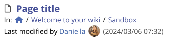
Right now if they need to see the author for some reason (or the creator, or the blame view, etc) they can navigate to the document. I don’t feel the last author is important enough to be displayed directly in the results.
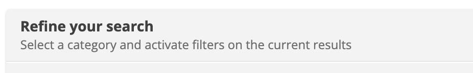
When you mention XWiki.org are you talking about help texts and descriptions about Facets?

On the current UI there’s already a help text explaining that this area is for filters. By naming the label “facets” to “filters” we can make it easier for the user to make the connection between the two.
Screenshot 2024-04-01 at 13.22.41.

Maybe we could try to use a parenthesis with the alternate label like “Facets (filter)” or the other way around, “Filters (facets)”.

I’m referring to all the places where we use the term Facets, see https://www.xwiki.org/xwiki/bin/view/Main/Search?sort=score&sortOrder=desc&highlight=true&facet=true&r=1&f_type=DOCUMENT&f_locale=en&f_locale=&text=facet

But also in the code: https://github.com/search?q=repo%3Axwiki%2Fxwiki-platform%20facet&type=code

Ah, got it now. Let’s stay with facets then, especially because of the release notes and user facing documentation. I can see that the word is hinted with descriptive text already so it’s not too bad.

I will update the proposal accordingly.