Changing the xwiki.org logo

Hello everyone! I’m here to discuss the xwiki.org logo! :blush:

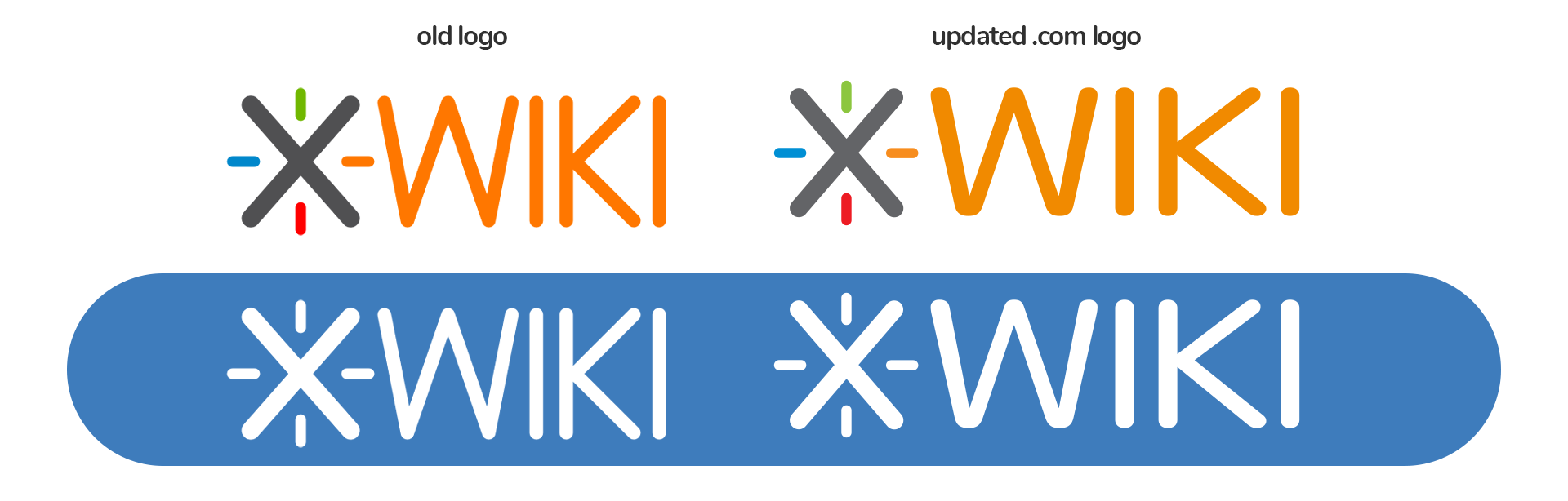
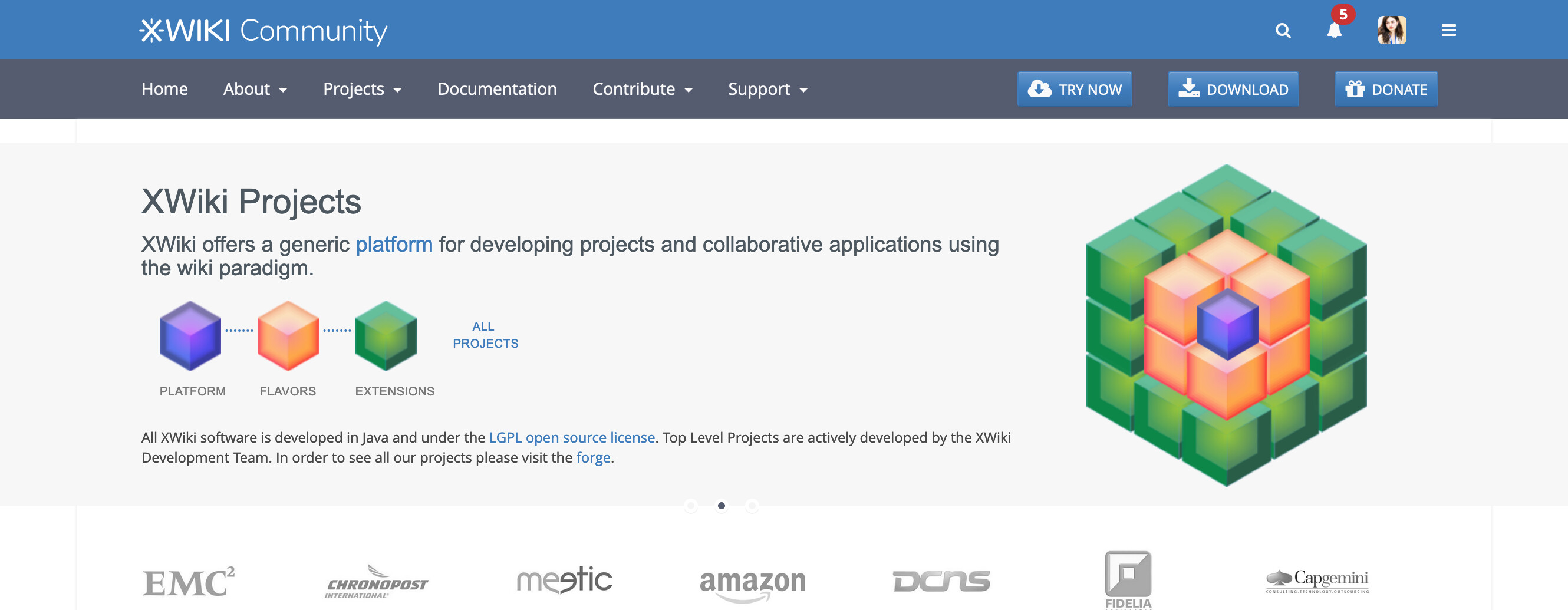
Right now, xwiki .org, any new instance created, this forum - they all use the old logo.

For the last couple of years, xwiki.com has been using the updated logo which is slightly improved in terms of font weight and width, without being too much of a change. This new logo has been presented in many contexts, for many years & it’s recognizable in this current form by many people.

Artboard 1

While xwiki .org is independent from xwiki .com, they have something in common: the standard product.

I believe we should make certain efforts to have the two websites cohesive in terms of core brand elements. The intention is not to make them look the same in any way; they serve different purposes and audiences.

This cohesiveness that I’d like for us to achieve is a way to:

  • enhance the overall XWiki brand
  • make sure new people just finding out about XWiki are not confused about the totally different websites
  • make the .org feel more modern (to reflect its product)

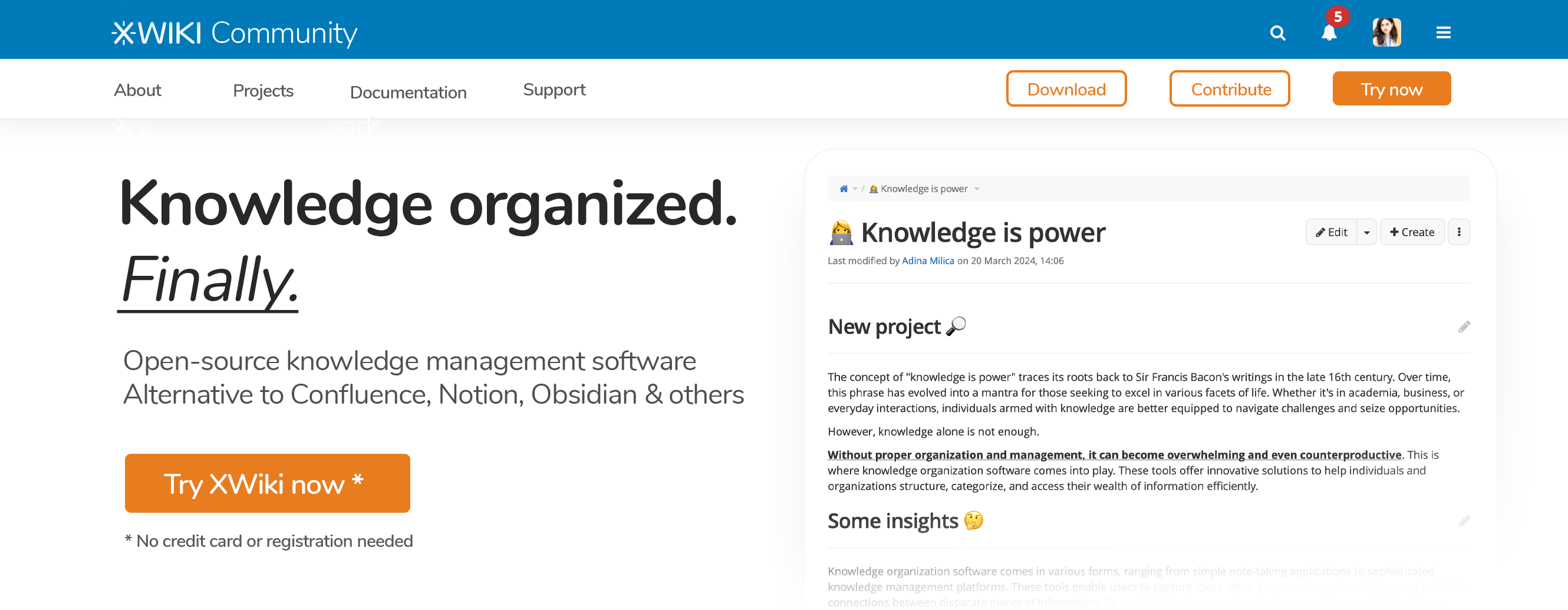
A first and very important step towards this is… the logo. I propose that anything related to .org (website, forum, any new instance created) to adopt the .com logo because of the reasons explained above.

This is how the new logo would look like on .org:

Screenshot 2024-03-01 at 10-33-04 XWiki - The Advanced Open Source Enterprise and Application Wiki (XWiki.org)

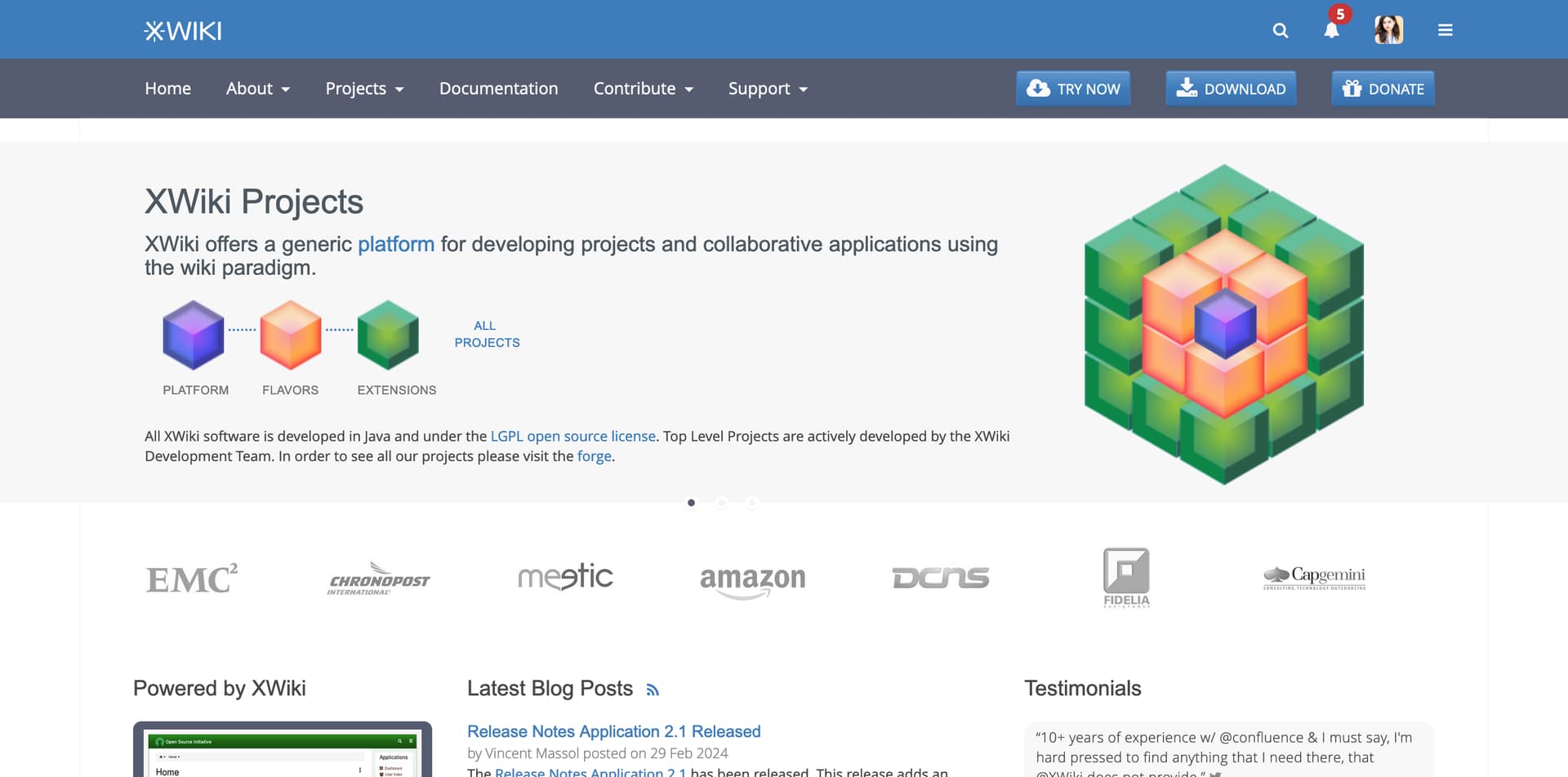
If you want to see an instance with this logo, see it here.

Conclusion

How do you feel about all of this? The community’s opinion on this is very important, so please let me know your thoughts & I’ll reply soon. :grin:

1 Like

To be honest, I would be totally unable to notice any difference if I was not seeing the old and new logo so close to each other, but I trust the designer :slight_smile:

Anyway, +1 to use the exact same logo.

1 Like

The difference is subtle, but it helps to convey a more modern image. Coherence is much welcome! Looking forward to seeing new fonts in actions!

I feel comfortable with the proposal. Thanks! Here my first +1 in this community!

Although perhaps a bit off-topic, I would like to see some proposal to integrate the corporative image of any XWiki based site with XWiki corporative image. Where could we put XWiki logo once removes from the top left corner of our XWiki instances? I see the footer with a link to the running XWiki release, but I think the logo must/could be included also there. An image always helps!

Scope

I think what you’re proposing goes beyond xwiki.org since the logo is also used inside the XWiki product. I can think of 2 places:

There are probably other places like the logo used on GitHub, DockerHub, and almost all the websites used for XWiki’s development. Another example is on logo challenge and devs

BTW the logo is also used on https://www.xwiki.org/xwiki/bin/view/Main/Supporters/SponsoringCompanies/

Thus I think this proposal should be to align the various XWiki logos used by the XWiki.org open source project everywhere and not just on xwiki.org.

History

I’ve tried to find again the history of the XWiki.org logo. Here’s what I gathered:

  • There used to be a xwiki.org logo with a bird, see Albatross Skin (XWiki.org) (there was some other logos before that, such as Dodo Skin (XWiki.org) )

  • Then, xwiki.org decided to “steal” the XWiki.com logo at some point (cannot find a trace of any vote or when it was committed).

  • Then we decided in 2010 that it was not good that xwiki.org had the same logo as xwiki.com. We started a blog post and a Logo challenge:

    Hi XWikiers! It’s time to inject new blood in XWiki.org. While discussing about improving its look & feel, we thought it would be a good time to create a new logo for XWiki.org as it’s an important part of a website design. We borrowed the current logo from XWiki.com some time ago and, in order to keep the distinction between the company and the Open-Source project clear, we think XWiki.org websites and projects need their own logo. As you may know, we love proposals, that’s why we’d like to make the logo design an open challenge, anyone interested can join and a vote amongst the community will determine the winner. Even if the main purpose of the challenge is to have fun, the person whose design gets selected will receive XWiki goodies, including his logo printed on a t-shirt obviously :slight_smile: The designer of the selected logo will [enter the Hall Of Fame>dev:Community.HallOfFame], and last but not least reward : the design will be spread wide (XWiki Enterprise is more than 10000 downloads/month and XWiki.org web site more than 50000 visits a month). [The challenge takes place on dev.xwiki.org>http://dev.xwiki.org/xwiki/bin/view/Community/LogoChallenge]

    In addition here are some reasons I gave internally for changing the logo:

    Some reasons:

    • xwiki.org should NOT be related to the company at all. It’s a community place where everyone interested in xwiki can come and play, on a meritocratic level. We also want to attract companies building on top of xwiki to enlargen the ecosystem. They won’t come if we’re not able to show we’re doing openly.
    • right now the logo is the same and will cause confusions between the community products and the company products. We want users to clearly separate community products from xwiki sas products
    • xwiki sas has or should have a trademark on its logo and it’s not right for the community to reuse such a trademark. Note that we have the problem on the name already (“xwiki”) and that xwiki sas should actually openly disclose what it will or won’t do regarding the name (since it could pursue anyone using that name).

    Note that since then Ludovic has publicly granted eternal usage of the XWiki name by the xwiki.org community (cannot find the mail again). We’d need to verify for the logo though as it’s not sure that we have a public authorization of XWiki.com to reuse their logo on xwiki.org.

  • The Logo challenge did not succeed: there was no proposal that was accepted by enough people in the community to make a choice that would be satisfactory and the challenge ended…

  • Since then, the xwiki.org community has not tried again to have a separate logo.

  • Also note that over time there were small differences in the logo between the version used by xwiki.org and the one used by xwiki.com. I don’t think there was an effort to have the same logo as it’s not supposed to be the same from the beginning.

Conclusion

This is why I’m not sure about:

and

I’d like to know more about what others think. Right now, I’m more like -0.

Thanks

What I would like to understand here is in what role you’re writing here @amilica: is this an official proposal of XWiki SAS to use the xwiki.com logo on xwiki.org or are you just proposing this as an individual? If this is the latter, my first question would be if we have the permission to use the current logo of xwiki.com on xwiki.org and in the product.

Regarding the colored version, the new logo has even less contrast in the text, the old one is 2.66:1, the new one 2.5:1 against white. Therefore, both fail the WCAG AA requirements for contrast which is at least 3:1 for large text and graphics. Without skin, we even display the logo against a non-white background that further decreases the contrast. If we change the logo, I wonder if we shouldn’t aim for a logo that passes WCAG AA requirements regarding contrast if we’re allowed to do that.

1 Like

I do like the xwiki logos. And even more in the symbolic version - the x.

But I’m with @vmassol that .org and .com should be seen seperately. Beginning with the logo.

When I first started working with XWiki, I often got the two mixed up.

Simpel

+1, but what aboutthe logo here in forum.xwiki.org?

My understanding is that the idea is to change the logo in the whole xwiki.org ecosystem.

1 Like

I think we have two options:

  • either use a completely different logo for XWiki.org than for XWiki.com (or at least one that is clearly distinguishable)
  • or use exactly the same logo as XWiki.com, if we’re allowed to

Using a very subtle variation of the XWiki.com logo doesn’t make sense to me. On my side (same as Thomas) I wasn’t even aware the logo is not the same. So given the context, I’m +1 to be consistent with the XWiki.com logo (if we’re allowed to) but I’m also open to have a different logo, but again, it needs to be clearly distinguishable.

Thanks,
Marius

1 Like

Same here.

+1

+1

I think the current .org logo with its sleek design has its very own charme. The .com logo looks like a bit to bold and wide.

I don’t know what the current status and timeline of the Crystal redesign is and when that becomes the default, but if the logo of XWiki.org is to be changed, it should probably be something that will fit very good to the upcomming and very modern looking Crystal design.

Yes, I agree. This is what I was going for.

I agree. I first wanted to get the opinion of the community and then we could discuss this topic internally in XWiki SAS to find a solution.

I’m writing as an individual that can take the opinion of the community and propose it internally in XWiki SAS. Right now, I do not know if we can use the current logo, but I’m confident a solution could be found if we’d choose to continue with the xwiki.com logo.

I’m aware of this. I’m not saying that the xwiki.com logo is perfect, but I think it’s a good compromise to have the logo in white on the current blue, this way ensuring contrast.

In the past, I’ve used the xwiki.com logo in dark gray in small places (like in the corner of a LinkedIn carrousel image). This is how the logo would look in dark gray or black. It’s a favourite version of mine, although it is not official (yet).

black logo

Thanks a lot for your feedback, Simpel, Marius and everyone that agreed with Marius! It is definitely helpful in getting a view on the community’s and team’s perception on this descision.

Proposal: xcom Logo + something additional

Do you think that if we used the xwiki.com logo as a base and added something to it (either some additional text, a different color, a symbol ), would it make more sense to fit both needs:

  • brand cohesiveness
  • clarity between the open-source community and the company behind it

?

This idea would translate into things like the following (they are just ideas, i used the bird as an example, not to be used commercially or in a final design):

org logos ideas

For reference, this is how the second logo would look like on the website:

org2

or in a hypothetical revamp:

org1

1 Like

Thanks for that. I personally don’t like very much the proposed suffixes (FOSS, Community, Dev Network) because:

  • It implicitly says there’s a version of XWiki that is not community. The XWiki open source project and the name of the project are just XWiki.
  • Stating that it’s open source in the logo feels really weird (why would there be the need to do so?)
  • Dev Network is even worse, looks like some microsoft thing :wink:

I feel that the logo should just be XWiki. And FTM get an agreement from XWiki SAS to reuse their logo.

In the future, if we have the energy for it, we could imagine restarting a logo challenge thread…

Hi,

IMHO :

This is not cohesiveness.

This is mixing everything.

Logo communication and marketing is very precise.
A Logo should not be mixed with something else than the brand it represent.
The brands : xwiki dot com
and xwiki dot org

Those are two brands.
Very different.
Only three things in common :

  • the Free Software Product (in common, even though xwiki dot com only make its products from it).

  • Vocation : providing tools for data management (wiki paradigm etc…).

  • Passion (and production) : motivation and lot of effort to provide all this nicely and properly.

But they are two brands.
Different brands.

It is fundamental to keep this clear : difference.
one is about community and FOSS.
the other is about customers, companies, efficiency, legals matters and insurances… etc…

FOSS is an asset.
With clear values.
If you mix it with commercial aspects,… ho la la ! :sweat_smile:
Look at what happened when Elastic Search, or Mongo DB changed “a little bit” their licences…
People are now saying : “It’s not FOSS !..”
(even thought… in real, … it is still very very close to Free Software… as far as you don’t provide the software in Saas mode to clients… without paying the commercial fees for this very specific kind of use).

=> don’t go mixing,… and loosing the asset of “pure” Free Software.

=> may be … (suggestion) : build two logos, that do the same : a common base, and show their specific.
xwiki dot com logo : Base + commercial value/message for the customer
xwiki dot org logo : Base + community values/messages for the members and contributors

=> may be dig a little on the messages, the values, and what is brought to the customers and members of the community.
For each activity, each organisation (community and company),…
One is building a software, and exploring the new features
The other is building a software and providing support and reliability on the software,

About the two brands, separate brands, (hence separate logos) here some examples.
Ubuntu and Canonical Ubuntu
Fedora and RHEL (same process to build the OS,… but separate brands. With Centos Stream in the middle… with new recent branding also… ho la la ! again… :rofl:).

JBoss EAP and Wildfly
may be the most significant example, similar to your need.
Two brands, two names. Clear separation.
They did this in 2011 (if I remember well).
They use these two names to explaine clearly the differences to people. Then people chose…

May be look at what do these communities/companies, about it : Elastic Search, Mongo DB, Colabora, Nextcloud…
(they have the same situation… and may be the same problem/solved logos ?)

=> may be spend more time, and effort, to build new logos, with the same base, and clear visual message added for each purpose and brand.
Or may be just enhance the xwiki dot org … to show the same software, plus the community message.

IMHO…

I do marketing and strategy, when I don’t code apps and run servers in prod.
Feel free to contact in pm or mail if needed.

1 Like

Same as Vincent, I think we should use only the logo for now, without any suffix.

Thanks,
Marius