Changing order of notification -> autowatch

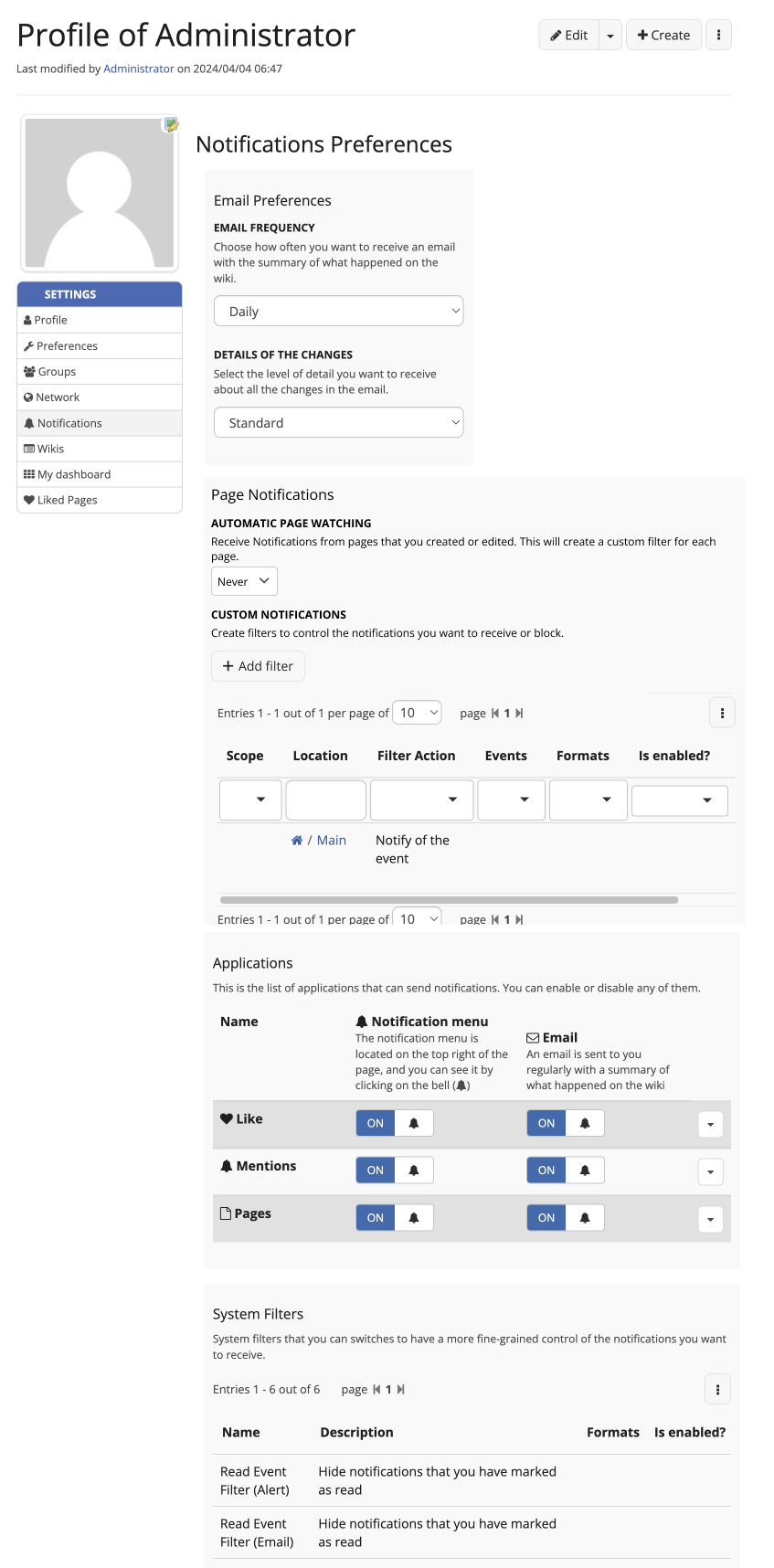
Hi! In order to solve XWIKI-18884: Inconsistent vocabulary and ordering of the “autowatch” feature in the user notification preferences we should consider moving around the autowatch user preference in the Notifications sheet. This can be a large change for user experience since they’ll need to scroll past the Applications section and System Filters table to get access to the autowatch feature. Moreover, this breaks user habits/expectations. On the plus side, this would make it easier for new users to understand that the autowatch feature and the custom filters are strongly related concepts.
Here is a before/after with a prototype of changes:
18884-beforePR
18884-afterPR
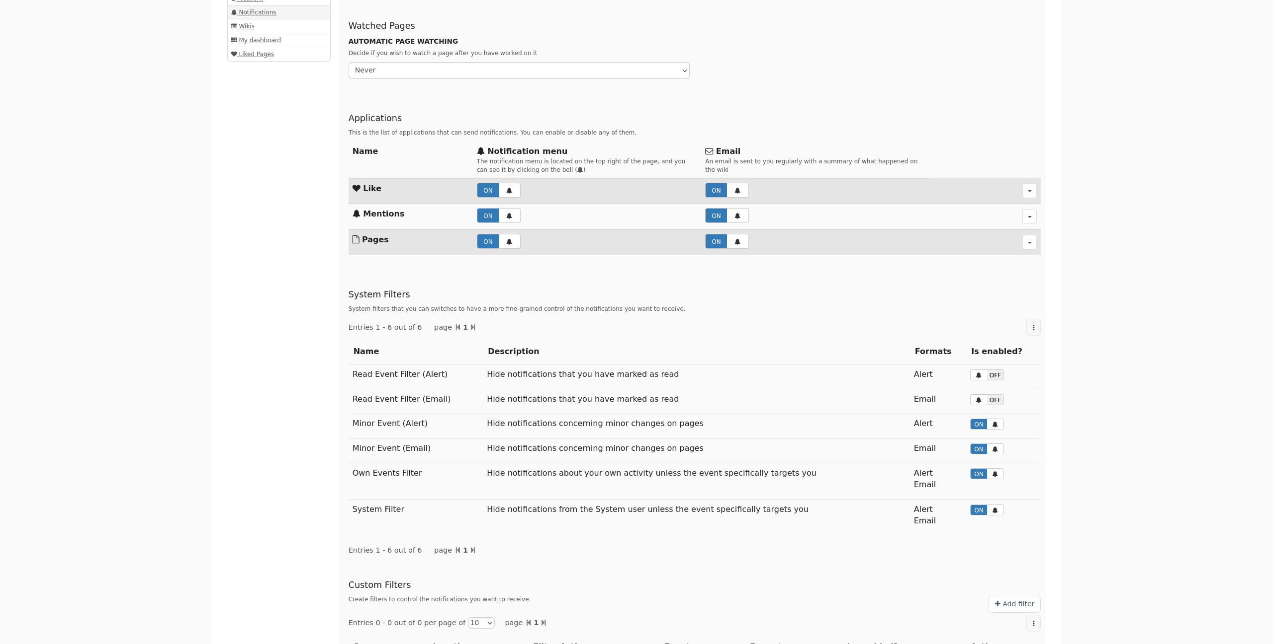
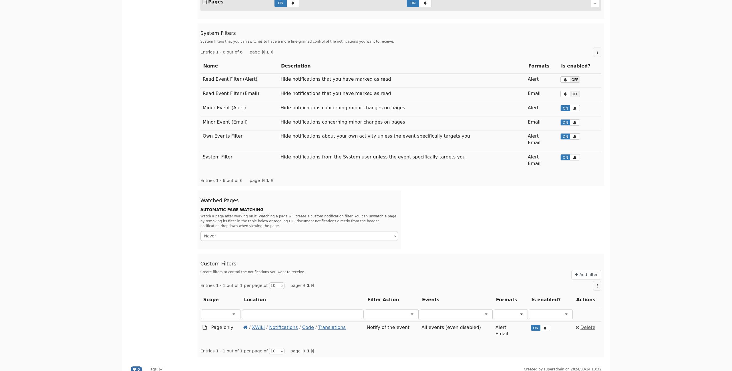
In these changes, the preference order has been updated, and some explanation about the watch vocabulary has been added.

Do you agree with this change?

Thanks in advance for your feedback!
Lucas C.

PS. I’ll close this topic and move on with a resolution of the ticket on the 4th of April.

Hi thanks for checking this.
Honestly I’m not a big fan of this specific move. I think I’d prefer that we rework it globally: maybe we need 2 pages of settings for notifications, one for types and one for watched pages? Now I’m not strongly against it so +0.
Would be nice to have @tkrieck opinion on this

Hey Lucas! Thanks for working on this and for the proposal.

It seems to me that both options are about user-controled notifications from pages, so I would mix these two options together and leave them at the current location on the page.

The upside of this change is that the user keeps a quick preference like auto watch in a prominent space on the page and you keep related options together. However, the downside of this is that the sections “Applications” and “System Filters” could be pushed down. It’s not a big downside for me personally, but I would like to hear from you also.

Another issue is that the space required for the table of the Custom Filters is quite large. I have a Jira about the design of the LD component, but I didn’t work on it yet.

We could name this integrated section as “Page Notifications” or something like that to keep it more on point about its use.

About the help text, I liked the link between two sections and its relation, but I feel the text is too extensive, perhaps we could reduce it a little bit.

Here’s a mock about these ideas:
Frame 1

1 Like

+1, thank you!

What do you think of this proposal @surli ?

Sorry still not a big fan :frowning:

I’m fine with moving system filters to the bottom of the settings as they’re not used a lot. Now I’m not sure it’s such a great idea to display the custom filters before the application settings as those are much easier to understand / manipulate for the users, than the custom filters.

I still think we could split this into two tabs maybe.

We discussed a similar subject a bit in Shortcut settings position. IMO the preference menu already has a lot of items and it can easily become too much if we add more. Right now there’s 8 items (already more than Miller’s Law | Laws of UX …) so adding a ninth comes with a non negligible UX drawback.

Note that we could use the opportunity to implement subsections in this menu (similiarly the administration one).

1 Like

I created Loading... to keep track of this issue. Since it came up twice in such a short time, I’ll try to make progress on this soon :slight_smile: