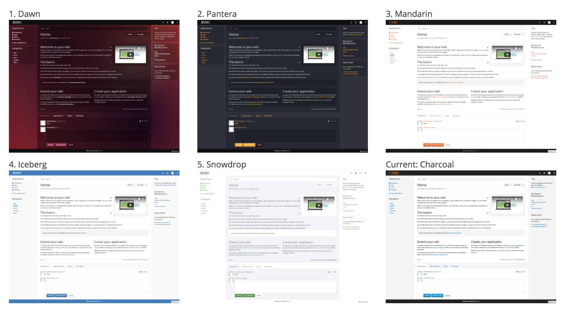
We want to refresh the default Color Theme (Charcoal) for the XWiki Standard 10.x cycle and we would like to know your opinion about the following proposals.
One nice thing about it is that the background is done with CSS gradients. So in theory we could change the colors to some “not wine” colors. The reason why I didn’t voted for it is that the editors have the white colors + we have some bugs with transparent colors. But having this theme as default might make us fix those bugs
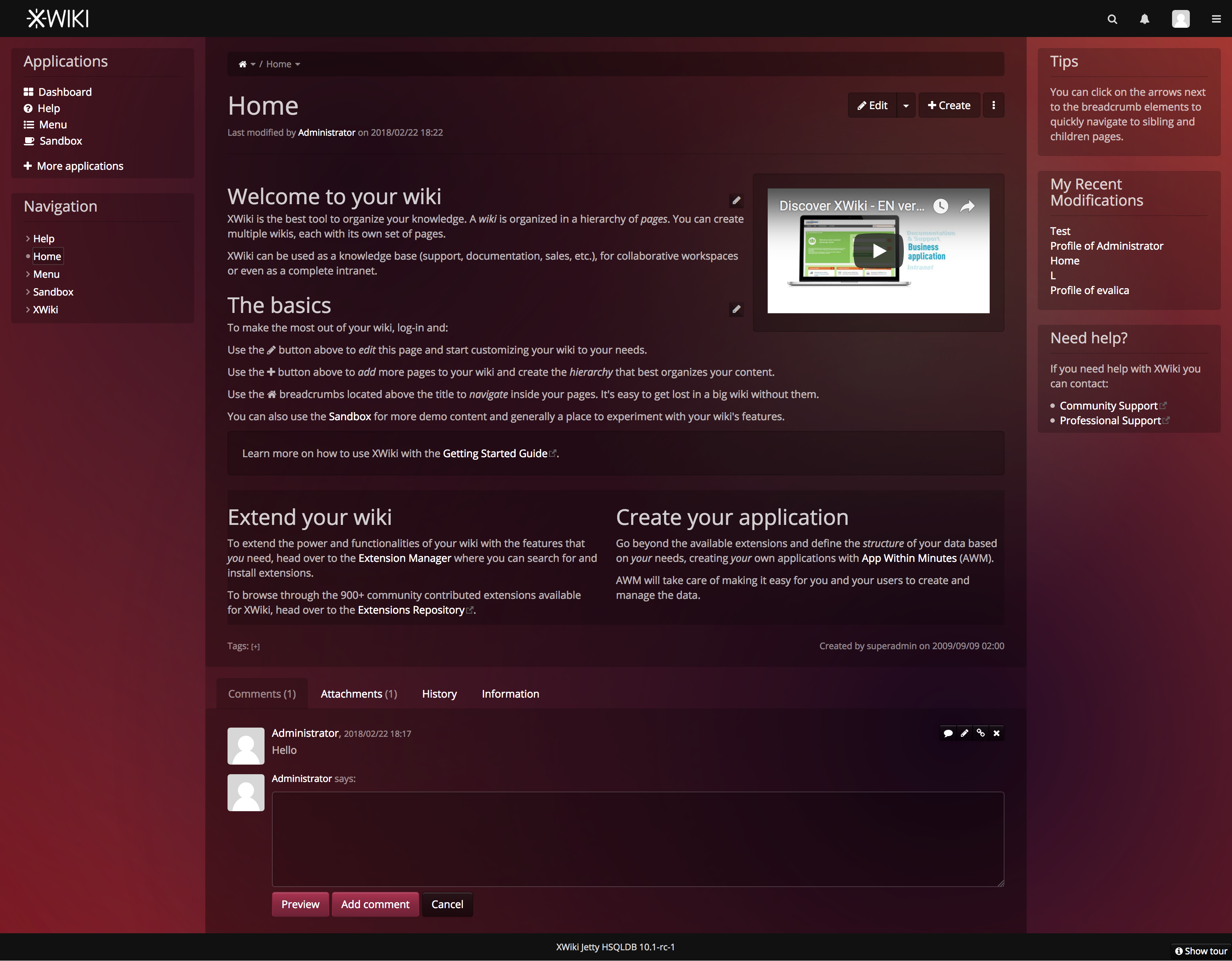
Pantera is nice, but I don’t think that a dark theme would fit everyone. IMO, there should be a way to switch between light(Iceberg with the yellow from Pantera)/dark(Pantera) and could make it better for all tastes.
The best themes are Pantera and Dawn, they are tech, modern, fancy and suggest the use of an app.
But the dark themes should keep a light tone for page content area (like in Procedures), as XWiki works mostly with documents .
(Can leave Main page as it is.)
Well, if the point of this voting is to “Refresh the colors of XWiki”, Iceberg seems to be a step backwards, it looks… outdated, I understand that out of the present choices it fits the most use cases, but I think we need something more modern, something that at first glance makes people say “Uuuu…”.
Dawn and Pantera are not without their problems, but to me they look like a step in the right direction, they make XWiki look like an app (a customizable app), I rly like the glassy look of dawn for example.
What I see as the problem with the dark themes is that it doesn’t quite fit pure text documents, which should probably have a more sheet of paper aspect.
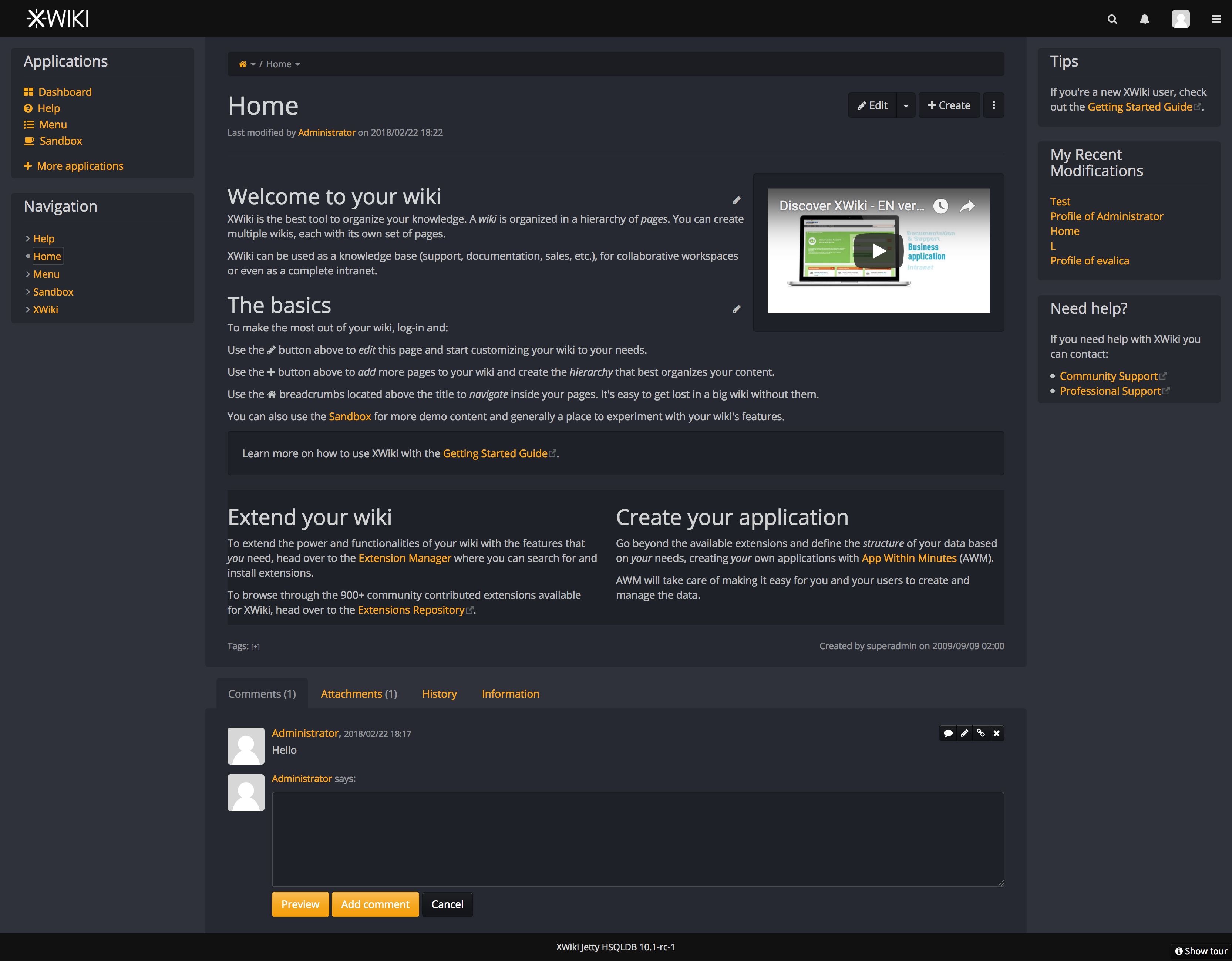
Cotton Candy looks nice especially on Groupware, since it was customized for the Flavor. But in Documentation and Standard has problems, because of the gradients, because of the links colors, because of the page content background contrast, etc. Still it was a nice experiment to create I’m glad you like it.
And this is our “problem” since it’s hard to find a theme that will cover all our use cases and tastes. When we will have Flavors, each flavor could define and use a dedicated/suited theme. Also people can switch and select from a variety of available themes to suit their style.
The Standard theme needs to be something easily customizable, readable, high contrast, etc. It will appear in all our documentation pages describing XWiki usage. But I understand from a marketing perspective it might not be the most “wow”
I understand the reasoning behind the iceberg choice (it’s the safe choice), it’s just a bit painful to see a bland theme chosen over such cool designs. I know it would be more of a gamble to go with a dark theme, but my fear is that the platform tends to look pretty much the same, version after version, and if there was a time to actually refresh the look, the round 10.X creates expectations.
The safe choice ensures it will not be received with hate, because it’s familiar, but it won’t attract attention either.
I think the worst that could happen it’s a reaction like, “hmmm… I don’t think I like it, I’m gonna change it to the old one”.
Also let’s not avoid the elephant in the room, Pantera will probably attract the attention of SublimeText users and Dawn the attention of Linux users (because all linux users know Ubuntu).
So I would try to go for, maybe a revised version of one of the two, with the content pages looking more paper like.
Also, does it have to fit every need at once? can’t it be something along the lines of “Here’s something cool, but you can change it to other cool themes that better suit your needs if this is not it!”
I like the iceberg one. I don’t find it bland but elegant and professional
None of which are our target IMO … Our target are business users.
The goal is to have a generic color theme that’s not going to antagonize anyone. If some users don’t like the default, they can change it. Using a dark theme as a default would be way too selective IMO and would appeal more to developers type of persons, which are the opposite of our main target (non technical users).
Your definition of cool may not be someone’s else definition of cool
For example, as a business user, did you consider that the current color theme in XWiki is so “unusable” that you absolutely needed to change it immediately? I think ideally we’d want that 80% of people find it ok by default.
The only other option I can think of would be to ask the user to select a color theme in the Distribution Wizard but I feel it’s overkill ATM with all the other work we need to do on other stuff in the roadmap.
I do not deny the validity of your arguments, and I’m not saying Iceberg is not good, yes it does look professional, my concern is that it’s way to similar to what we had in the past, it looks like a merge between the default colibri and flamingo.
In any case, I have voiced my opinion, if the majority thinks it’s the right way to go than I can’t argue with that, I know I’m not exactly in the target audience and I can’t be completely objective.


