Notification Quick Actions proposal

Hello all,

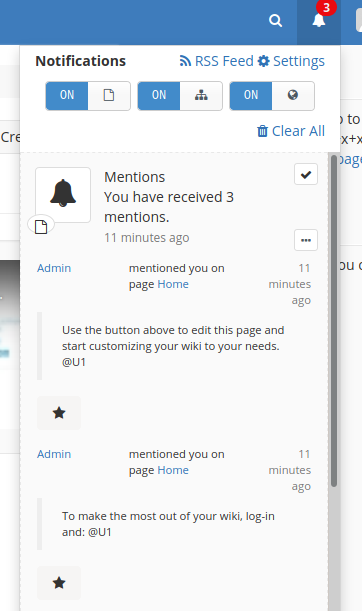
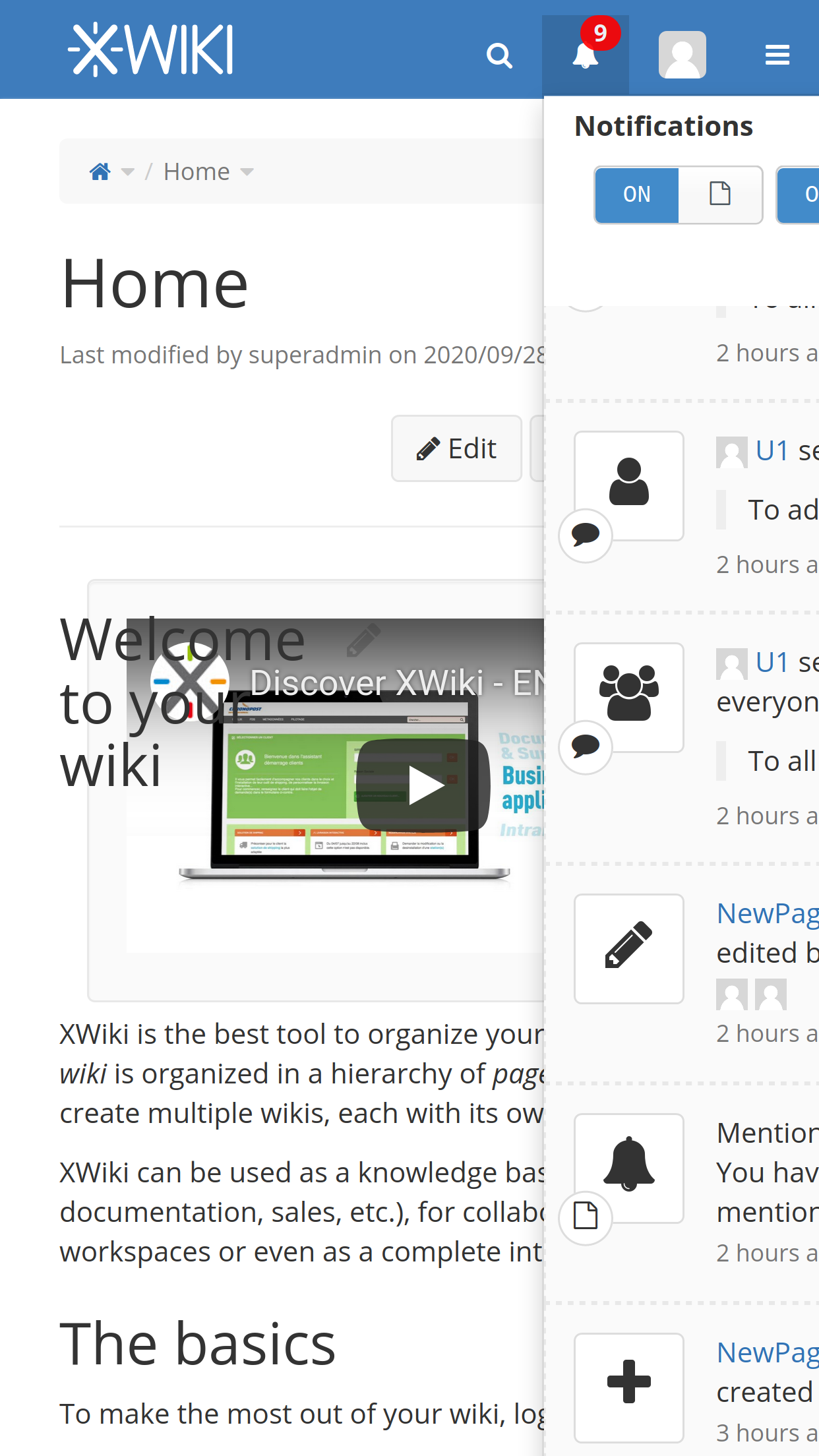
Currently, the notifications mechanism of XWiki allows to display notifications and to mark them are read.
To increase the interactions on the notifications, I propose to allows developers to declare quick actions for the notifications event.

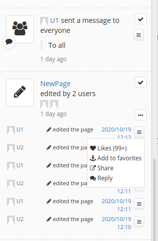
A quick action takes the form of a icon displayed at the bottom of an event in the notification pane, and triggers an action when clicked on.
For instance, liking the document linked to the notification, on opening a modal to quickly answer to an event.

Visually, the quick action takes to the form of clickable icons displayed at the bottom of the notifications, and are visible in the notification pane and in the activity stream.
image

Proposed architecture

The proposed architecture follows the existing mechanism used to declare custom displayer for the notifications using Notifications.Code.NotificationDisplayerClass XObjects.

I propose to introduce the Notifications.Code.NotificationQuickActionDisplayerClass, with two fields:

  • Event Type: Declares the name of the event for which the quick action must be displayed.
  • Template: the template used to display the quick action.
    This class is bound to a WikiQuickActionDisplayer role using a WikiBaseObjectComponentBuilder to register the declared NotificationQuickActionDisplayerClass objects.

The template form is not constrained but the good practice should be to display simple clickable icons, possibly complemented by a short text (for instance, the number of likes of the event).
Clicking a quick action should either directly trigger the action, or open a modal screen with a larger UI.

Impacts on xwiki-platform-notifications-notifiers-api

  • new NotificationQuickActionRenderer role: render the quick actions of an event
  • new DefaultNotificationQuickActionRenderer class (implements NotificationQuickActionRenderer). Loop over the registered quick actions that matches the current event and render them. The results of the rendering of the different quick actions are grouped on a div.
  • A new Block renderQuickActions(Event event) method in NotificationNotifiersScriptService called from templates/notification/macros.vm to display the quick actions.
    A new NotificationQuickActionDisplayer role, in charge of the display of a single event quick action.

Impacts on xwiki-platform-notifications-notifiers-default

  • WikiNotificationQuickActionComponentBuilder register the WikiQuickActionDisplayer from the Notifications.Code.NotificationQuickActionDisplayerClass XObjects
  • WikiNotificationQuickActionDocumentInitializer create the Notifications.Code.NotificationQuickActionDisplayerClass XClass
  • WikiQuickActionDisplayer implements NotificationQuickActionDisplayer

Impacts on xwiki-platform-web:

  • New call to $services.notification.notifiers.renderQuickActions($event) on the event displaying loop of temaplates/notification/macro.vm
    The quick actions are current not displayed in the mails and the rss feeds.

WDYT?

There’s something ambiguous when looking your screenshot: the notifications displayed there are actually grouped, so when you mark a notification as read, you don’t mark a single notification, but a group of similar notifications.
This is currently our standard way to render the notifications.
When looking on the screenshot, it seems to me that the quick action will also apply on the whole group of notifications, and not on a single notification: I assume this is not what you want since I’m not sure what meaning it would have. So it means that the position of the quick action icon should in fact be located next to the actual single event, displayed when you click on the 3 dots icon. It probably means some refactoring of the existing templates to display notifications.
WDYT?

You are right, the quick actions are displayed for each event.
Here is an example with a group of mentions where you can the quick action being displayed several times.
image

What is misleading in my first screenshot is the icon being align to the left. It should be instead left-aligned with the text content of the event, event when a single event is displayed.

PS: AFAIK, just placing the call to $services.notification.notifiers.renderQuickActions($event) at the end of the event loop (just after the tr tag should be ok).

Thanks for the confirmation.

We’d really need some more screenshots with different kind of events (like quick actions for page editing / mentions / new comments) and with different quick actions icons, to be able to imagine how it would look like with lots of notifications.
Right now I’m really not convinced by your screenshot: the quick action button seems to be in the middle of nowhere and it’s difficult to understand what it’s related to. Personally I would have preferred to have those quick actions aligned with the other actions (the mark as read and the “more” buttons), but I understand it’s not doable if we have many actions. Unless we imagine a single button opening a menu to the possible quick actions, but it really starts to become heavy to have a menu inside a dropdown.

I’m not sure I like that too much. It doesn’t feel nice visually. It feels that it’s taking too much space.

I’d prefer a hamburger menu (“more actions”), maybe next to the “mark as read” action (or even replacing it maybe).

Right now we have 2 actions:

  • Mark as read
  • Show more details

What you’re asking is how to generalize this concept and be able to add more actions.

So we need a generic place that doesn’t take much visual space and under which we can add as many actions as we wish (like “reply” or “discuss” in the future, in addition to the “like” you’re mentioning).

But it won’t scale at all if we display them as you suggest IMO.

Note :I’m not against a single hamburger menu and move the “mark as read” and “show details” under it.

I haven’t checked your design but it looks complex. For me it’s the same as for the UI. We need a generic concept of actions and refactor the “mark as read” + “show more details” to use it.

Not exactly: remember that those two actions doesn’t apply on a single event, but on a group of events. Example: image
So what Manuel propose here is new actions to apply on single events: that’s make them even more difficult to display.

Sure but it’s the same concept for me. BTW how do you mark as read only a single event? :slight_smile:

So we have 2 choices: decides that actions are done for all grouped events (like the “mark as read” or “show details” actions). So you’d “like” all of them at once.

Or we start deciding that it’s possible to have actions for single events and have that hamburger menu for all single event actions (mark as read, like, view diff, etc).

You don’t right now :slight_smile:

FYI we discussed with Manuel yesterday about that problem yesterday, and we come up with some ideas about using mouse over interaction to display actions over the single event. Manuel wanted to do some mock-up to test that option too.

+1. Mark as read and Show more details are quick actions for me. So any new quick action should be handled in a consistent way. I agree with Vincent that we cannot show all of them. They have to be “hidden” under a hamburger menu.

How would that work on touch screens? It doesn’t sound like a good idea to me. Notifications is an area where we should think “mobile first”.

Thanks,
Marius

What make it difficult is that currently, the mark as read action is displayed on a group of notifications, and only allows to act on the entire group.

Some quick actions we’d like to propose should be actionable on a single notification, even if it is part of a group. And in this case, even if we hide the quick actions behind a hamburger menu, we still need to decide where we show the new hamburger menu icon.

What could be discussed is if we want to generalize over the mark as read action and propose two kinds of quick actions:

  • group quick actions
  • notification quick actions

Indeed that’s an important point to consider.

Side note, I tried to display the notifications on a small screen (414x736px) using the firefox developer tools and this results is not really friendly:
Screen Shot 2020-10-19 at 14.39.01

I’ll try to send some screenshot of some new design alternatives in the afternoon.

Also, since we are call them “quick actions”, I’m personally in favor of trying to minimize the number of user actions needed to use them. The more they are hidden behind expandable menus, the less discoverable and usable they will be to users.

Before moving to some more advanced UX prototype, I’d like to share my early results with the introduction of a “hamburger” button on the right column of the notifications.

The button is displayed:

  • Directly below the “mark as read” action if the notification group contains a single event
  • On the right of the notification if the notification group contains multiple events (in this case, the user needs to expand the notification group before having access to the quick action button).

This first proposition is using the ‘more-vertical’ icon from the icon set
Screenshot from 2020-10-12 16-34-27cropped

The second proposition is using the ‘menu’ icon
Screenshot from 2020-10-20 16-51-10

We can either allow only icons, or allow to display some text aside.

Only icons:
Peek 2020-10-20 15-39

Only icons on my smartphone:

Icons + text:
Peek 2020-10-20 16-45

This is a quick prototype and some aesthetic aspect are not polished, but I’m interested in early feedback before going deeper in this direction.

The most interesting points for me are:

  • the discoverability: the button is directly visible from the user once a notification is displayed
  • rely only on basic user actions (mouse click on a computer, no sliding on smartphone)

+1, this looks better to me than the menu icon.

I prefer this. It should look like a standard drop down menu where menu items can have icons. We don’t have this icon-only menu anywhere in XWiki and it looks too cryptic to me.

I think the direction is good.